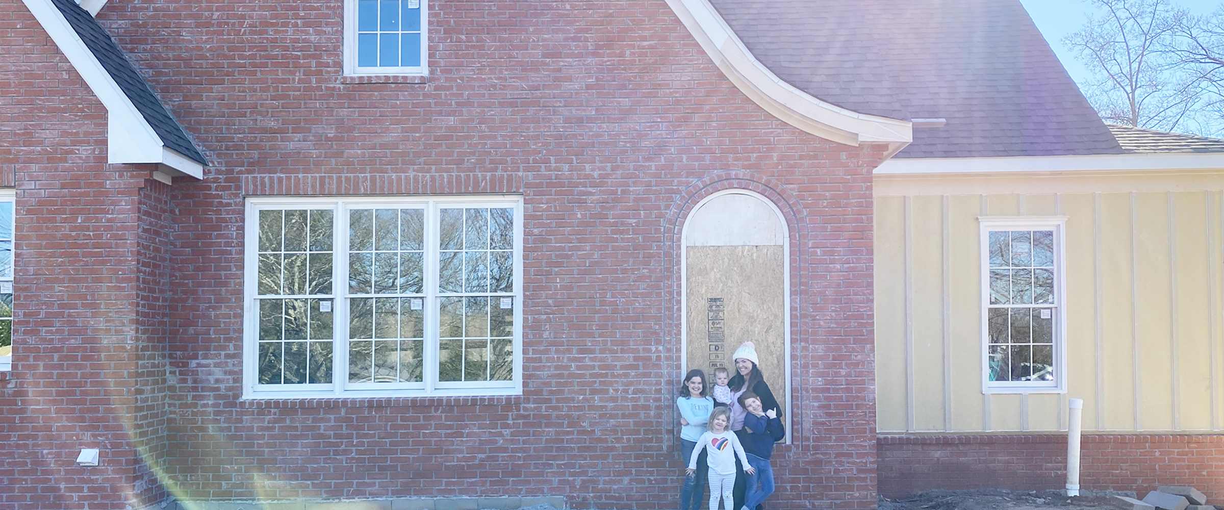
Our Renovation Floor Plans
I'm hoping to start sharing more details about our renovation on our home; it's pretty exciting, and I know it's something many of you are considering. It can feel extremely overwhelming on the front end if it is something you have never done before. In this post, I'm going to share the before and after floor plans of our home and go into some details about our process. It's probably going to be a long one, so feel free to scroll through to see floor plan images if you'd rather not read all the steps along the way.
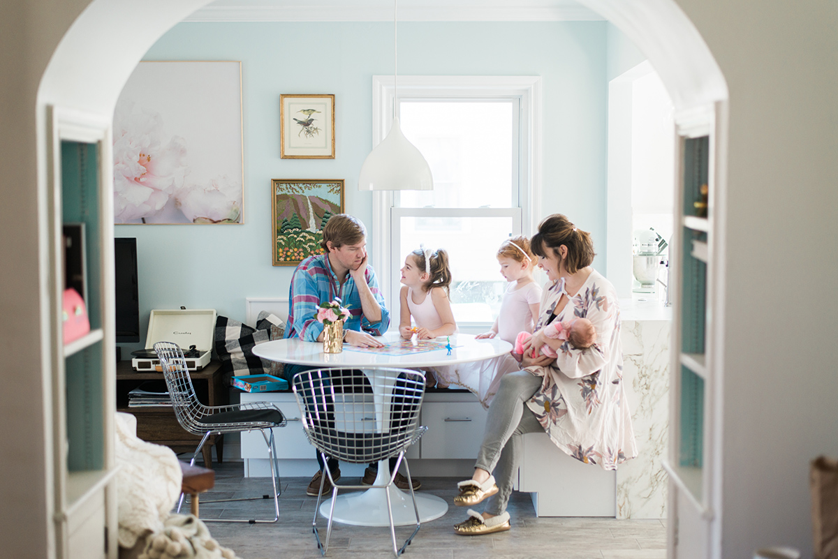
To start with, our home was built in 1948. We moved in a year after we were married, in 2008, and somehow I blinked and we found ourselves pregnant with our fourth baby in a home that we had outgrown. Every space did double duty; you can see above that this was our sweet little dining space. I loved it, but it was just becoming impractical for all of us. Our three big girls shared a small bedroom and we had converted what was formerly a dining room into a nursery.
Below is what was the existing floor plan of the main level of our home:
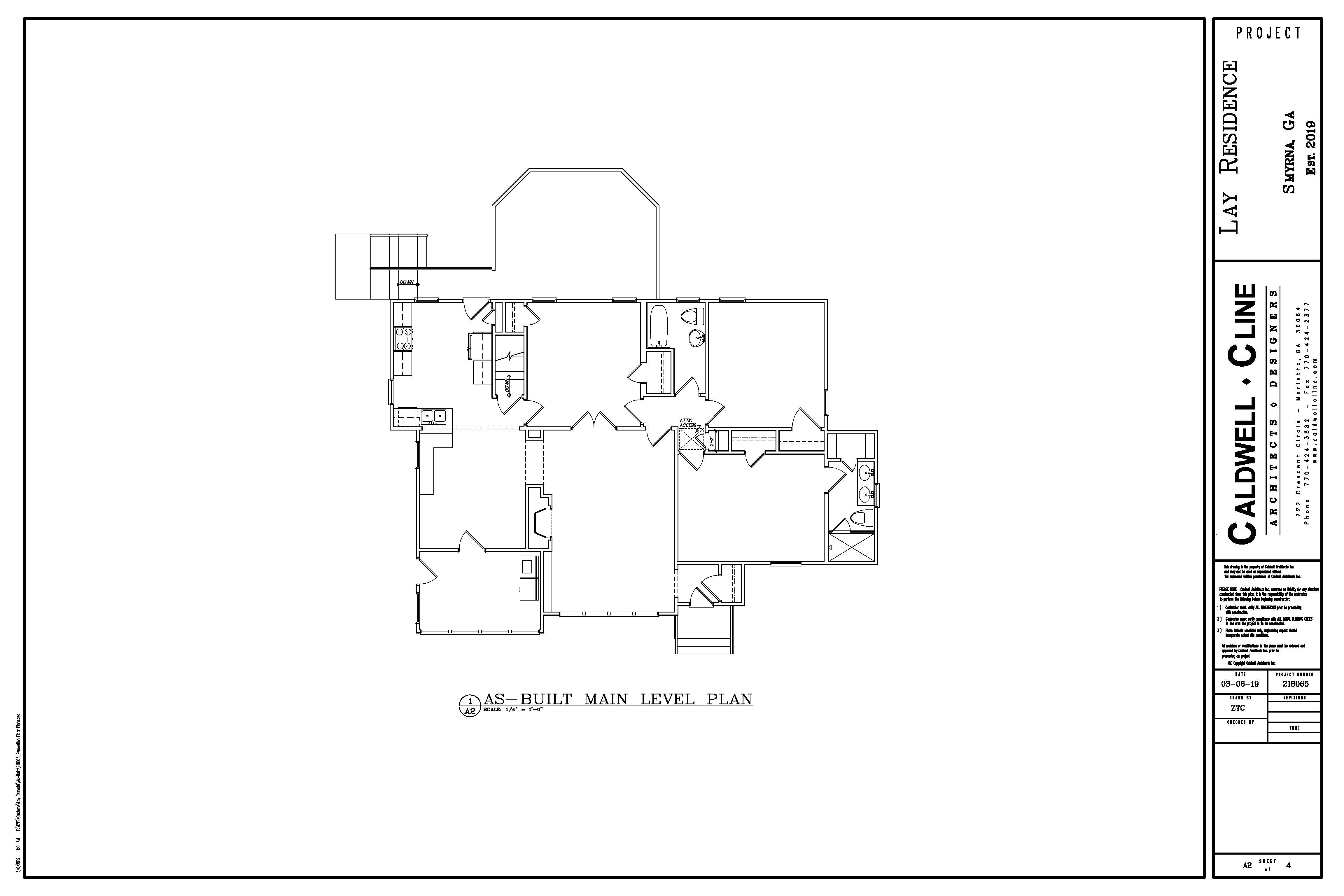
Honestly, I don't mind living in a smaller space. I love having our girls share rooms. However, we also love hosting. We love having parties, and we love letting our girls have friends over, and our space was really limiting that. Plus, we could hardly fit around our dining table, and adding another baby was going to make that even more difficult. Having dinner guests over was nearly impossible!
We have had it in our minds for years to renovate and add on, but it was such a daunting task that we couldn't seem to make that leap.
(Also, for those asking, the real estate in our neighborhood is really increasing in value; we have a great, roomy lot and can walk to several restaurants, the library, and other things, so moving to a new house wasn't really a great option. It would be difficult to afford a house we loved that would fit our family, and it wouldn't have the same great location and lot, so it made sense to use the equity we already had in our house - we were nearly halfway through a 15 year mortgage.)
Our house does have a basement; it was not well finished and while it had some great square footage, it wasn't a reasonable space to use as a bedroom (there was no bathroom down there), and the stairs were cramped and steep.
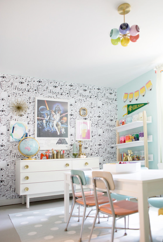
Here is the floor plan of the basement, as it existed before the demo:
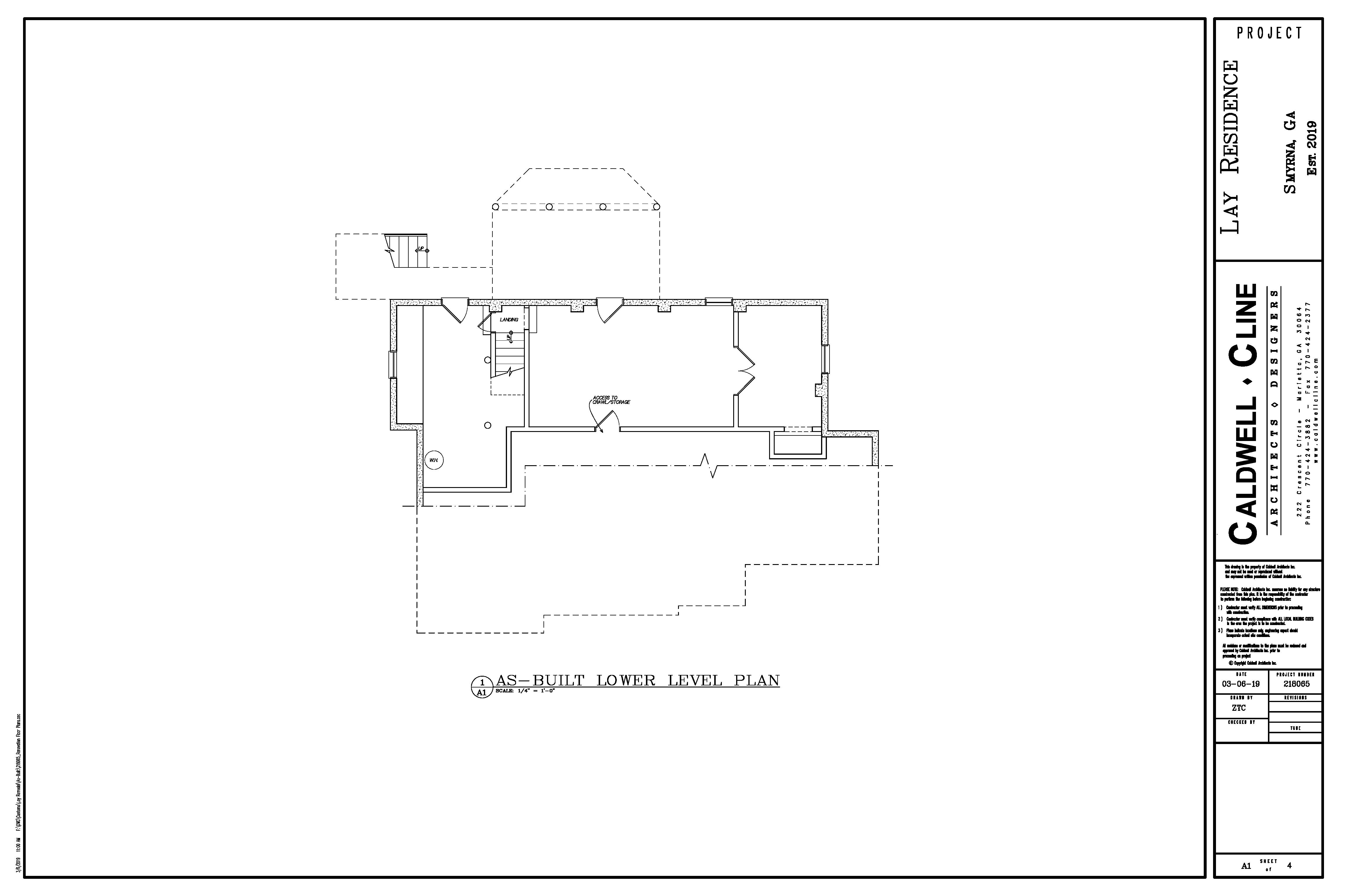
The storage/former laundry room was also incredibly depressing (moving the laundry upstairs was a total game changer), and it was ill used and unproductive square footage - really the whole basement was, other than my favorite craft room.
Initially, Chip and I thought we would just build out the back of our house to add on some space. We thought that would be most cost efficient, but I didn't totally love that as it meant the front of the house would stay mainly the same, and it didn't make sense to me to create a beautiful addition while the front of the house was lackluster and ill designed for us.
Finally, we found some houses close by that we loved as we sometimes drove around for inspiration. They were completely out of the box gorgeous and different from anything we had seen. I think seeing them really sparked some excitement about what we might be able to do, because they were renovations in similar sized lots with similar seeming constraints. We contacted the architect, and were so excited to meet with him. His work is just gorgeous.
However, sadly, he flaked. Like ghosted us. We met once in person, and then got no response.
We kind of dropped it, uncertain what to do next but at the same time inspired, and then we found out we were expecting Marjorie. And so we had a deadline to make a decision.
Our neighbor is actually a contractor (he is awesome, and I'm happy to share him once our project is done!) and has renovated a ton of houses in our area. We always wanted to use him, so finally we just asked for his architect and met with him. It was the most fun. First, he had some of his team come to the house and take measurements and create "as-built" drawings so that we all knew what we would be working with, and we set up an appointment to sit with him for a couple of hours to talk through what we wanted and dream up what we could do.
Being that he was a space expert and had done this lots and lots of times, he was able to pull out of us what our goals were (more space for entertaining, more bedrooms for our girls who will one day be teenagers with bathroom needs, and a highly functioning basement that integrates better with our backyard). He convinced us quickly that the way to go was up, especially since I have never been in love with the curb appeal of our house and hoped to improve the facade. We were surprised to learn that would be less expensive than going out (i.e. adding more foundation), so most of the new square footage is in a second level, even though we did expand out of the back of the house a bit.
So, like a lot of people, this ended up being quite the renovation plan and way more extensive than we originally thought, but we are so excited about it, and I'm also extra excited that going up also allowed us to create 9' ceilings on the main level, which is something I've always wanted.
Ok, ok, so here come the floor plans. First up, I'll show you the main level. I told the architect that I almost wanted it to seem ridiculous how much space we were adding in for entertaining. We now have a huge family space in the back of the house and an amazing covered porch. The dining space will be in the middle of the house between the kitchen island and the stairs, and the living room in the front is the one room that is staying the same in the whole house (except for those 9' ceilings!) and we are calling it the library:

The girls' bedroom and the former master bedroom are combining to make a master suite, and I'm also excited to have a powder bath for guests that I can hopefully keep neat and orderly, as our former guest bath was the girls' bathroom, which I'm sure you can imagine had a very low to nonexistent neatness level.
We are also adding a carport; I really didn't want a giant garage on the house, or a place where I could just stuff a bunch of junk (I know myself too well), so we decided on a pretty and open carport.
Next is the upstairs!
So, one interesting thing to note is that we were creating these plans while I was pregnant (we first met with the architect in October, I believe, and we didn't get plans finalized until January, and Marjorie was due in early May and came two weeks early). To be honest, I was kind of in a state of PLEASE, LET'S JUST GET THIS THING DONE OR I WILL GO CRAZY, so I glanced at the plans for the second level, and said, "looks fine." There was more space, there were bathrooms, so we were good.
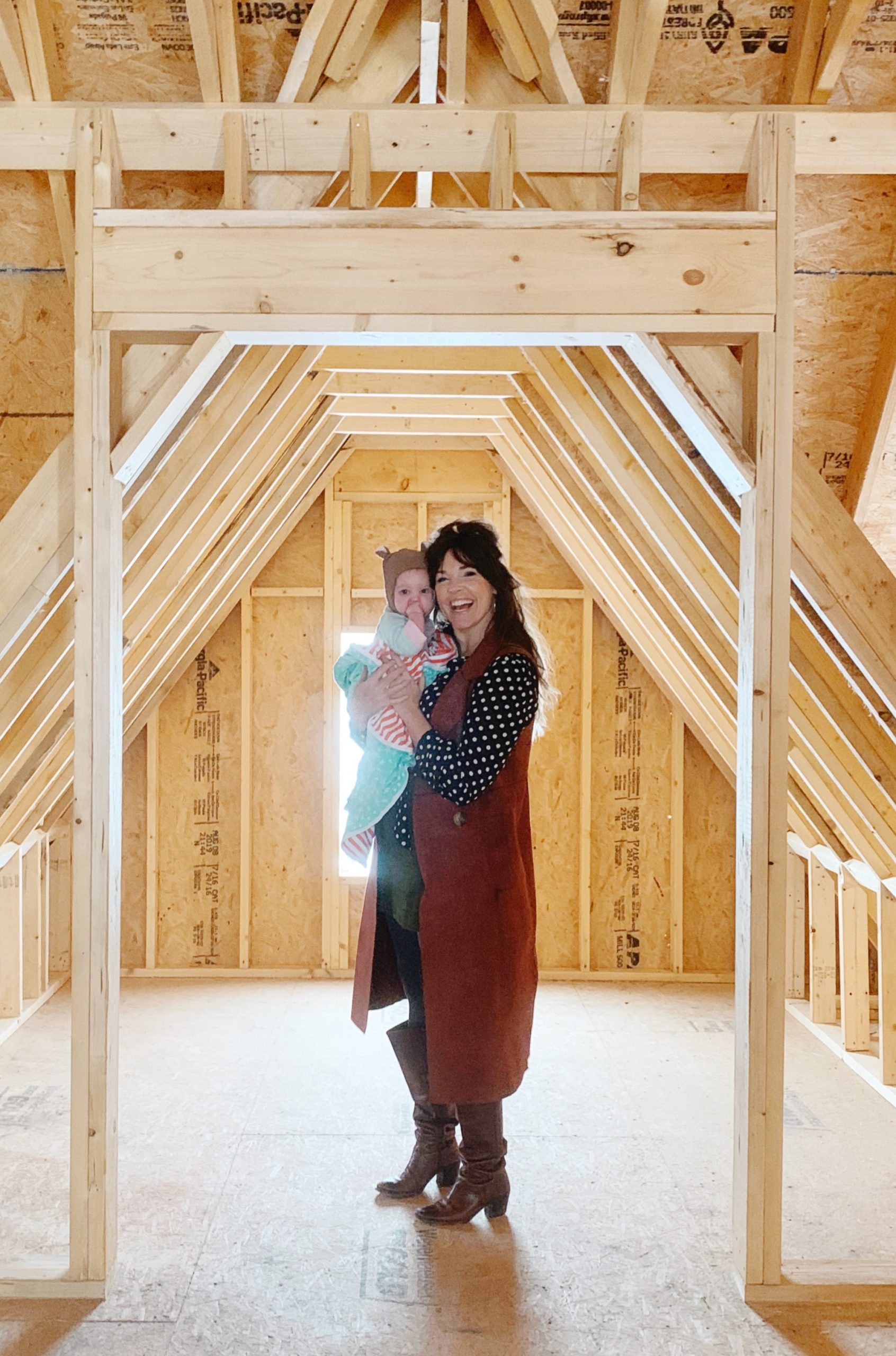
However, once the upstairs was framed out, we walked the space, and there were a couple of issues/opportunities. Firstly, the loft was intended to have 9' ceilings, but as I drove by the house (daily to stalk it, of course) and they were finishing up the framing, I fell in love with the tall vaulted ceiling, and we asked our contractor to leave the ceiling pitched and it's SO PRETTY I CAN'T HANDLE IT.
Secondly, on the front left bedroom, there was a closet, but then behind the closet we have the prettiest little tudor window. In the plans, this space is closed off (whyyyyy?), but we ended up axing the closet and putting and arch there and finishing out the space. It's like a little A-frame playspace that is going to be so good that I want to live in it. Here you can see a little peek - Marjorie and I are standing where the arch will be:
Also, the shared bath infringed heavily on the bedroom space, making it feel cramped and a challenge to furnish. I'm still on the fence about who will sleep where, and it may very well end up that we keep the three big girls in this room together. We ended up deciding to use the space over the carport (which makes me so happy, because otherwise it would just be this empty space existing simply to make the house feel balanced from the outside!) to create another bath along with the closet for that bedroom. I also really wanted a double vanity somewhere, and that is where it is going. You can see the edits above with the red lines.
Lastly, here is the basement space:

That empty space behind the carport in the drawing is no longer there; our yard is a bit of a challenge because it slopes heavily into the backyard, but the rest is the same. Chip is so excited to make a little recording studio, and I'm so happy to have a more enjoyable and usable space downstairs that opens into the backyard.
One other detail I'll mention is the stairs. Because of the layout, it made sense for the stairs to go up from the back of the house. I've never seen that before; I always have the Father of the Bride house in my head with the grand staircase extending towards the front door which I think is so lovely, and I DID NOT want guests coming in the front door and seeing the back of a staircase. Or a closed in staircase with a door. It just felt so opposite of what we wanted. So, after much sketching and pinterest searching, we designed an open stair, and I love it so much. It's the centerpiece of the house, and I love that it will keep everything feeling light and open. Here is a picture as it exists now, looking towards the front door:
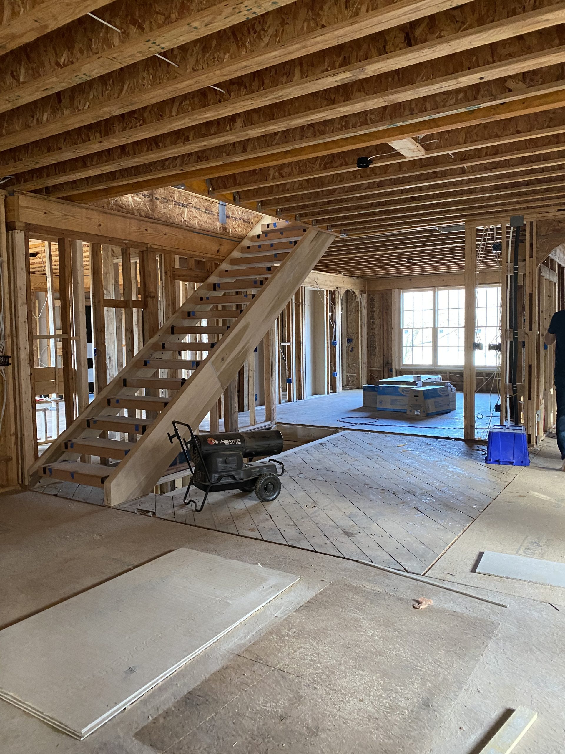
It's going to be gorgeous.
So, that is were we are at. Drywall should be going in very soon, so it's going to be picking up speed quickly, and we are on the countdown to move in, which is honestly hard to believe. Please let me know if you have questions - I'm sure I missed so much, but was trying to keep this from being too much of a novel. Be sure to check out my instagram story highlights under "house reno" and you can see a tour of our house as it was!
Discussion