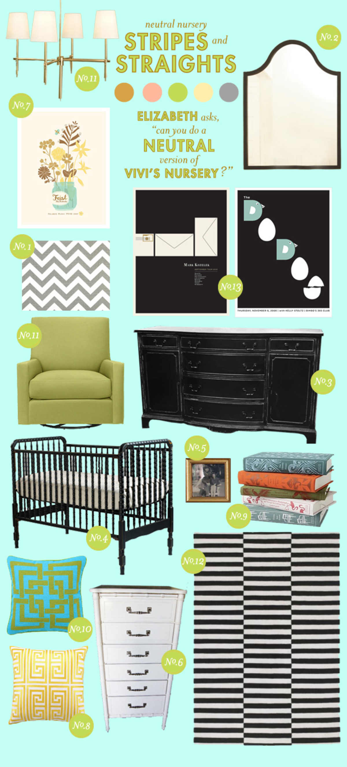
stripes and straights
(Click on image, and links will appear to the right.)
Elizabeth asked for a neutral twist on Vivi's nursery. By sticking to furniture with straighter lines and geometric shapes, and using punches of green and yellow rather than pink, the room takes on a more neutral feel. The Feist poster may be a little more feminine, but I love the colors!

Discussion